What is Font Proofing?
As a type designer, you frequently aim to produce fonts that are not only aesthetically pleasing but also consistently and correctly work across all platforms and devices. This is where font proofing comes in.
But what is Font Proofing, and how do you do it?
Font proofing is the process of ensuring that a font displays correctly across all platforms and devices by checking it for technical issues like spacing and kerning. In order to confirm that the font is displayed consistently and without any issues, this involves testing it across a variety of operating systems, browsers, and devices but also on paper. Let's break that down shall we:
Checking for Technical Errors
One of the most important aspects of font proofing is checking for technical errors. Technical errors can range from incorrect kerning between letters to incorrect character mapping (if you type an apostrophe, you don’t want to see a foot-mark). These errors can significantly impact the look and feel of the font and it is crucial to identify and correct them during the proofing process.
To check for technical errors, a font proofing template can be used. This template is a document that lists all of the characters in a font and provides a space for proofing each one. It should include things like spacing, kerning pairs, paragraphs and information about the character's performance at different sizes. This information can be used to check for consistency in the font and identify any technical errors which can be quickly fixed in your font design.

Testing at Different Sizes
Different font sizes can highlight different issues, such as spacing or kerning problems. By testing the font at different sizes during the proofing process, you can identify and correct any issues before the font is released.
Checking for Language Compatibility
If you work on multilingual fonts, it is important to test the font for compatibility with different languages and characters. This involves checking for proper character mapping, spacing, and kerning in each language.
Ensuring Consistency on platforms and devices
Ensuring consistency in the font across all platforms and devices is essential. Inconsistent font rendering can cause issues for users, such as making the text difficult to read or understand. By proofing the font, you can ensure that the font appears the same on all platforms and devices, providing a better user experience. I can’t help you with the last one, you’ll have to test it yourself, but what I can help you with is a font proofing template.
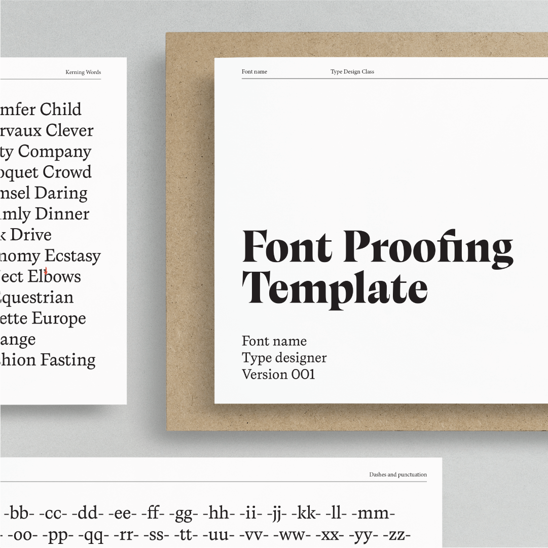
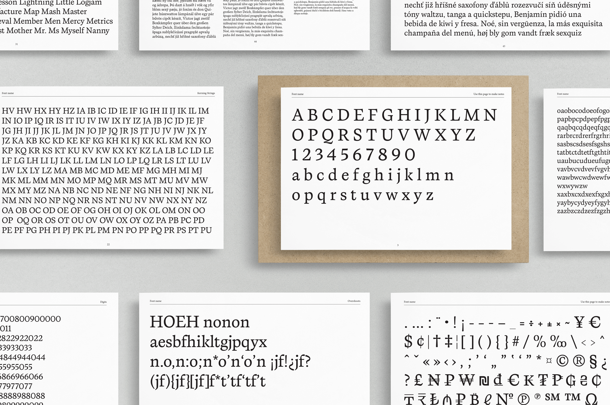
The Font Proofing Indesign Template is the ultimate tool for type designers to check the spacing and kerning of printed fonts. This comprehensive template has everything required for a thorough proofreading experience, making it ideal for refinement.
This template has 44 pages of content, which includes:
Basic Latin characters for notes
Spacing groups
Kerning groups
Kerning words
Dashes and punctuation
Symbols and parenthesis
A variety of words and paragraphs
Large-character pages at the beginning of the template are for making notes about your letterforms that you can later change in your font files. By saving you time and ensuring that your fonts are flawlessly polished, this template is made to make font proofing as easy and effective as possible. By editing the Paragraph Styles you can easily adjust the fonts to your own.
Whether you're a seasoned typographer or just starting out, this template is the perfect addition to your design toolkit. So why wait? Grab your Font Proofing Indesign Template today and take your font proofing to the next level!

Donate to The Coffee Fund
Have you received help with your font, letterforms, or did I answer your burning type or design question? Do you want to return the favor, but are you not sure how to do that?
You can always buy me a coffee or a bag of beans, you decide, whatever you think my help was worth to you. Please feel free to make a donation to the Coffee Fund.